Why Homes & Gardens highlighted Project London on 2026’s colour forecast
This piece reframes the usual “Colour of the Year” conversation, shifting the focus away from predictable neutrals towards shades that feel warm, expressive and timeless.
The article presents an expert-led selection of colours that designers believe will define interiors next year — from rich earthy browns and deep greens to softer, more serene tones. Among the key trends, Homes & Gardens spotlighted a quote from our own Marcelina Janiszewska, offering insight into why one particular colour has captured designers’ imaginations: powder blue.
Powder Blue: Calm, Fresh and Future-Ready
While much of the mainstream focus on 2026 palettes has been anchored in rich earth tones and moody shades, Marcelina highlights the growing appeal of powder blue. As she explains in the article:
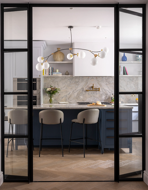
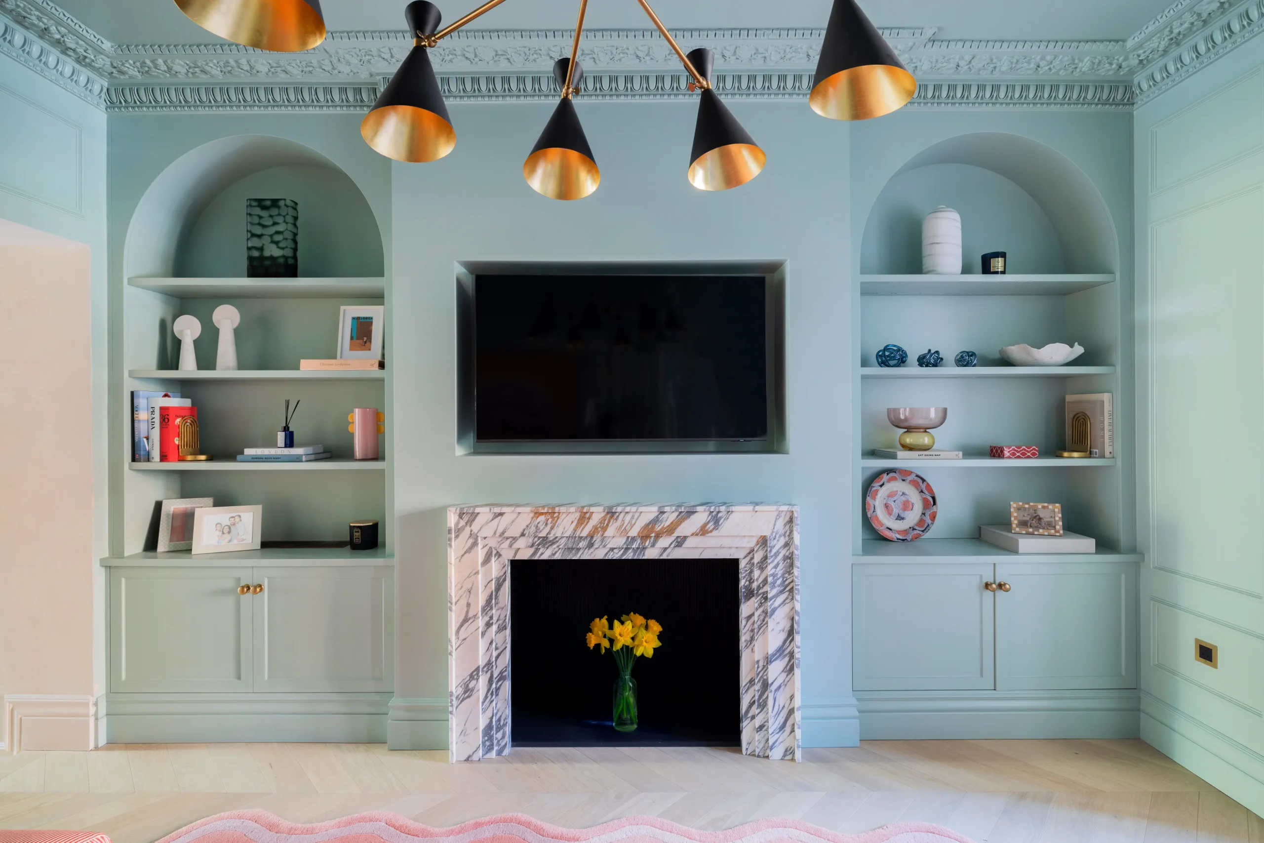
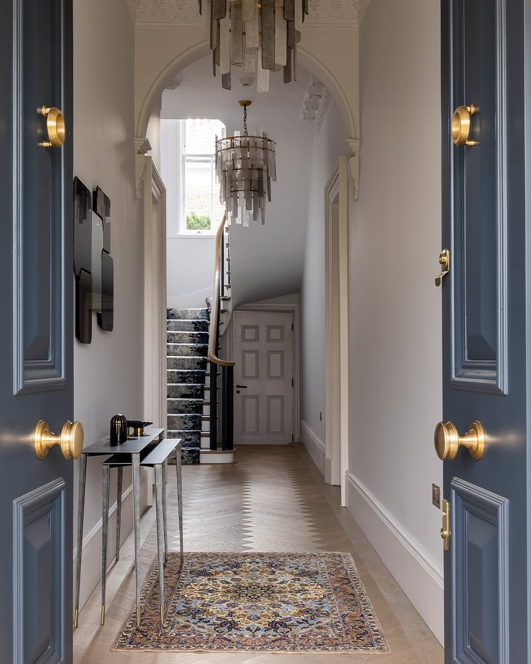
“Powder blue is set to be a standout colour for 2026, offering a softer, more expressive alternative to classic neutrals. Its light, calming quality makes it particularly suited to bedrooms, children’s spaces, and areas where a sense of ease is key, while still feeling grown-up when layered thoughtfully. It works beautifully alongside warmer tones such as ochre, mustard, and bronze, or with natural greens for a more grounded feel.”
This perspective reflects a broader shift in interiors, one that favours emotional resonance and nuanced combinations over stark simplicity.
Being included in Homes & Gardens’ colour conversation affirms something we’ve long believed at Project London: that great interiors aren’t just about the latest trends, but about a considered use of colour that responds to mood, materiality and narrative. Marcelina’s viewpoint on powder blue reflects our commitment to thoughtful palettes — ones that elevate spaces with depth, emotion and longevity.
It’s exciting to see these ideas gaining traction in broader design discourse. As we look towards 2026 and beyond, we’re more inspired than ever to continue exploring colour in ways that feel both timeless and inventive.
