
Choosing Colour That Works With Your Home: Feature in Livingetc
For us, it raises a bigger point about how we approach colour.
We rarely think a colour is simply “good” or “bad”. What matters is how it sits within the architecture, the natural light, the materials around it and, most importantly, the people living with it.
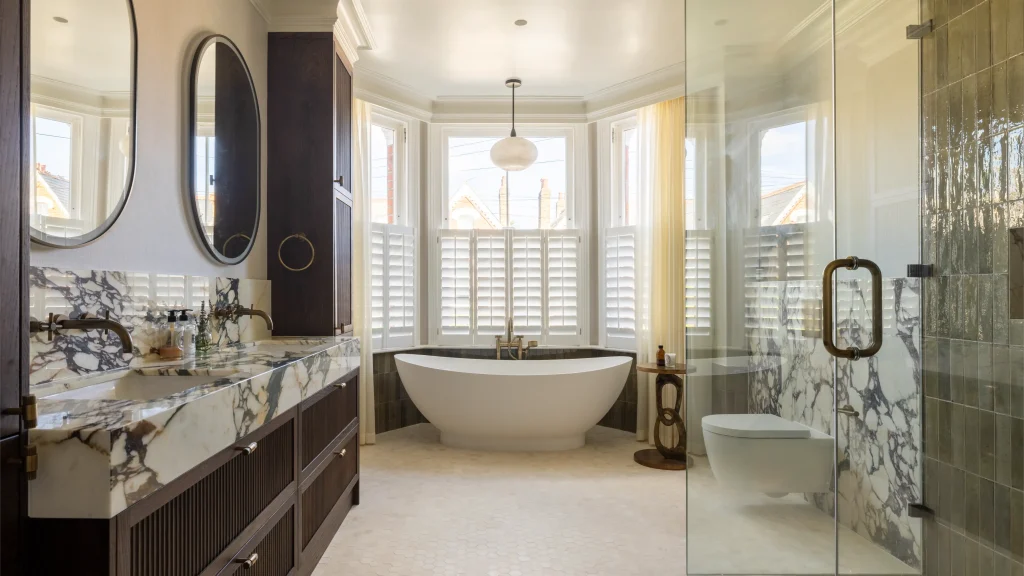
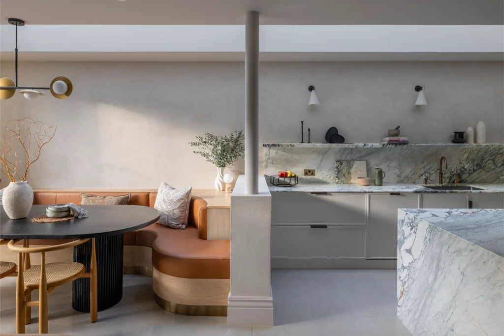
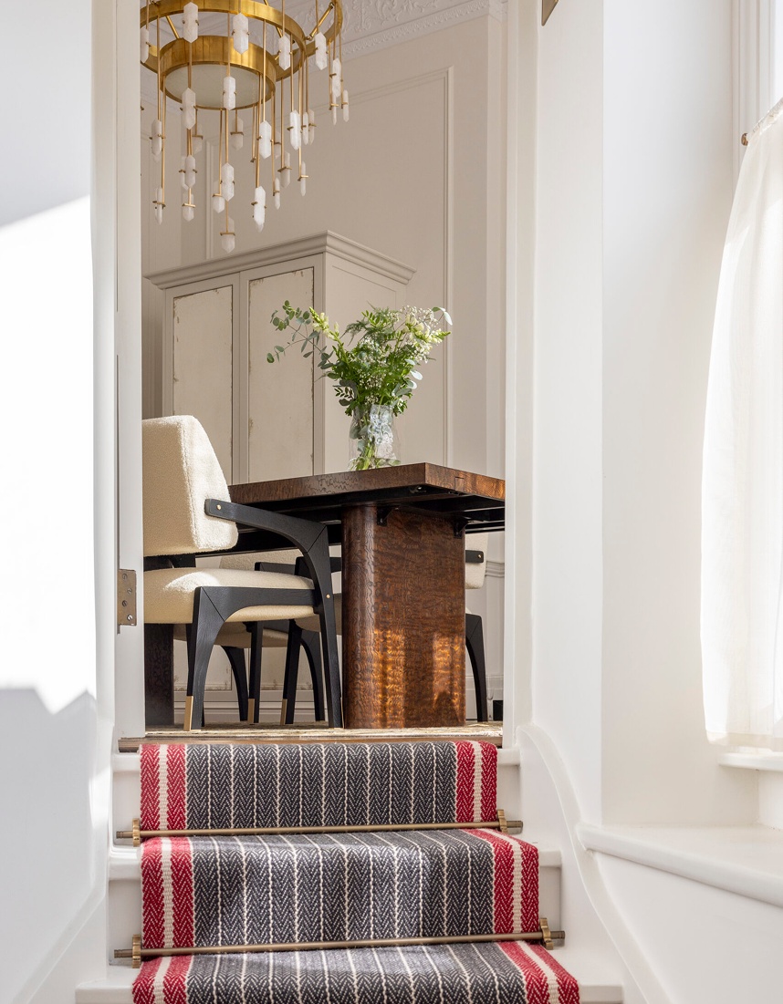
One of the shades discussed in the feature is brown. It has made a strong return to interiors, and we agree that the right brown can bring depth and warmth to a room. The wrong one, however, can quickly feel heavy.
As our Interior Designer, Gemma Luteijn, explains:
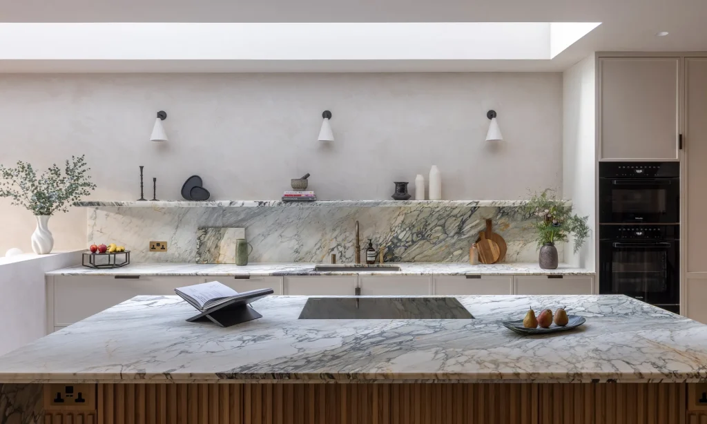
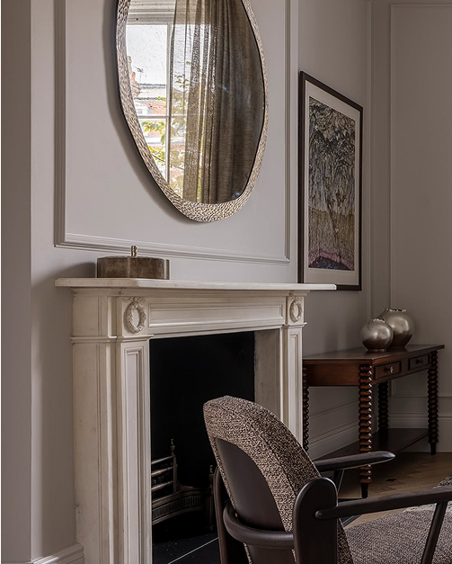
“A muddy base palette makes it harder to build an inviting scheme around. Timbers are often warm and therefore feel too contrasting with overly dark and cool tones. Similarly, antique brass and bronzes are complemented by warmer colors.”
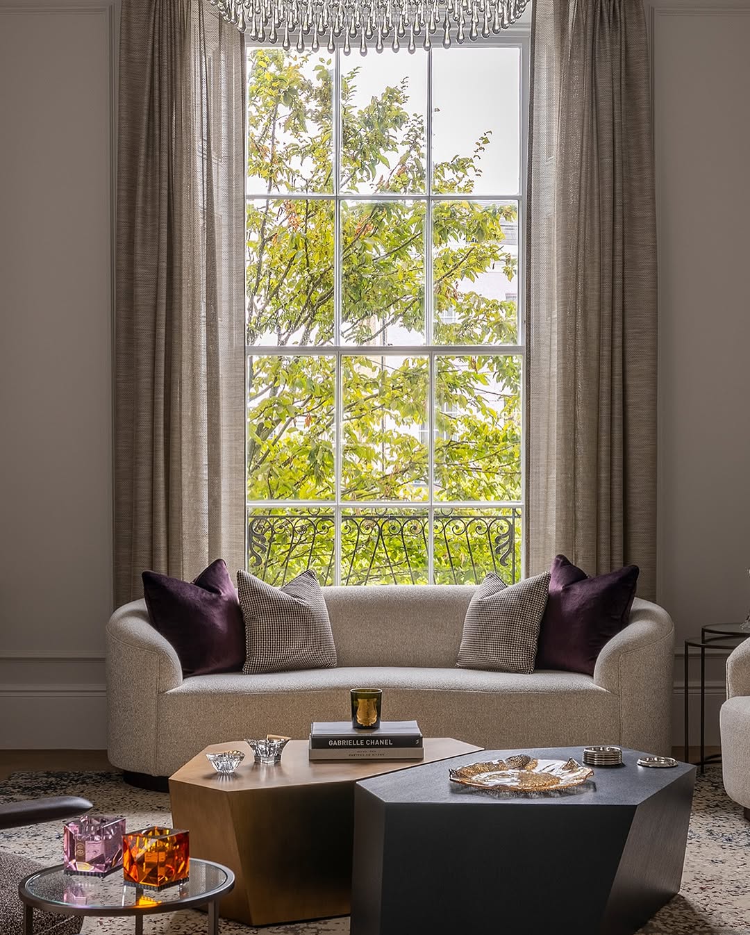
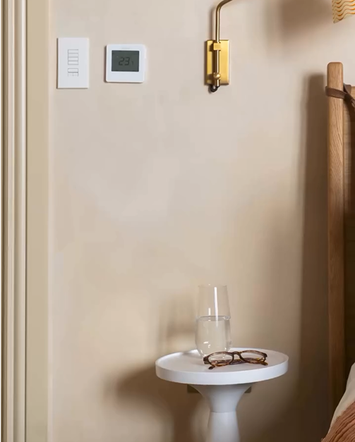
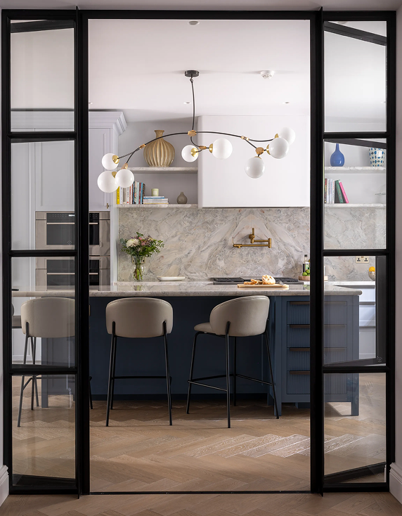
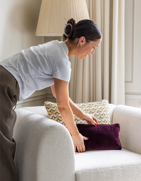
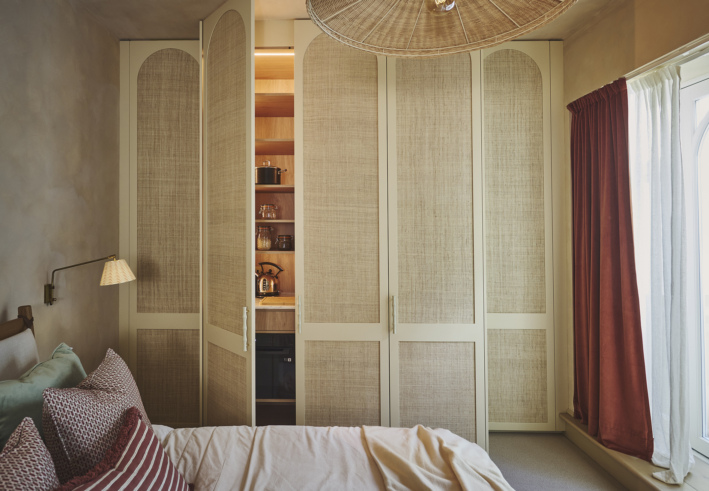
Our preference is to start with a palette that gives the rest of the room room to breathe. Warm neutrals can provide a versatile foundation, allowing different materials, artwork, joinery and furnishings to build the character of the space rather than forcing everything to work around one dominant colour.
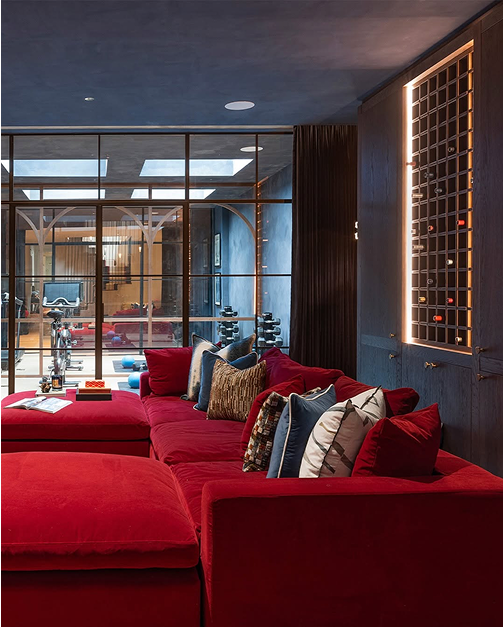
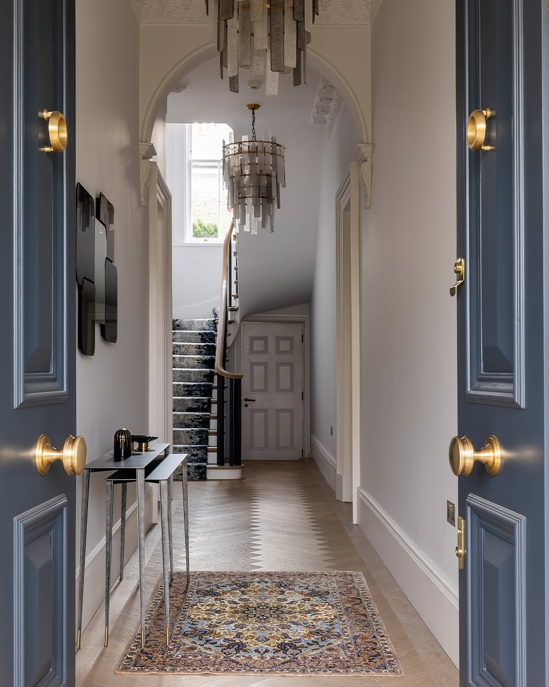
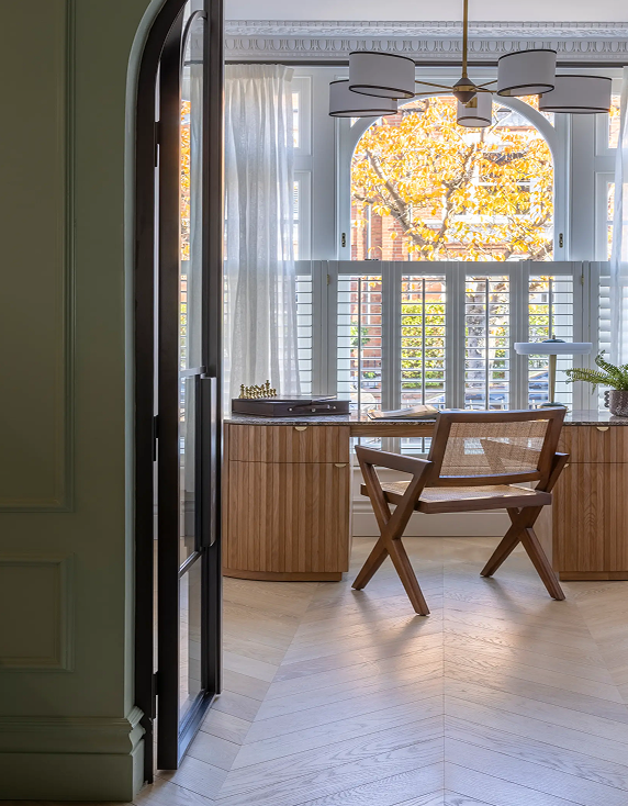
That doesn’t mean avoiding stronger colours. Quite the opposite. We love using colour when it has a reason to be there. A deeper tone can highlight architectural details, create atmosphere or give a room a completely different energy.
The key is not to decorate around what happens to be trending. It is to understand why a colour works in that particular room.
Read the full feature in Livingetc, where Gemma shares her thoughts alongside other leading designers.